
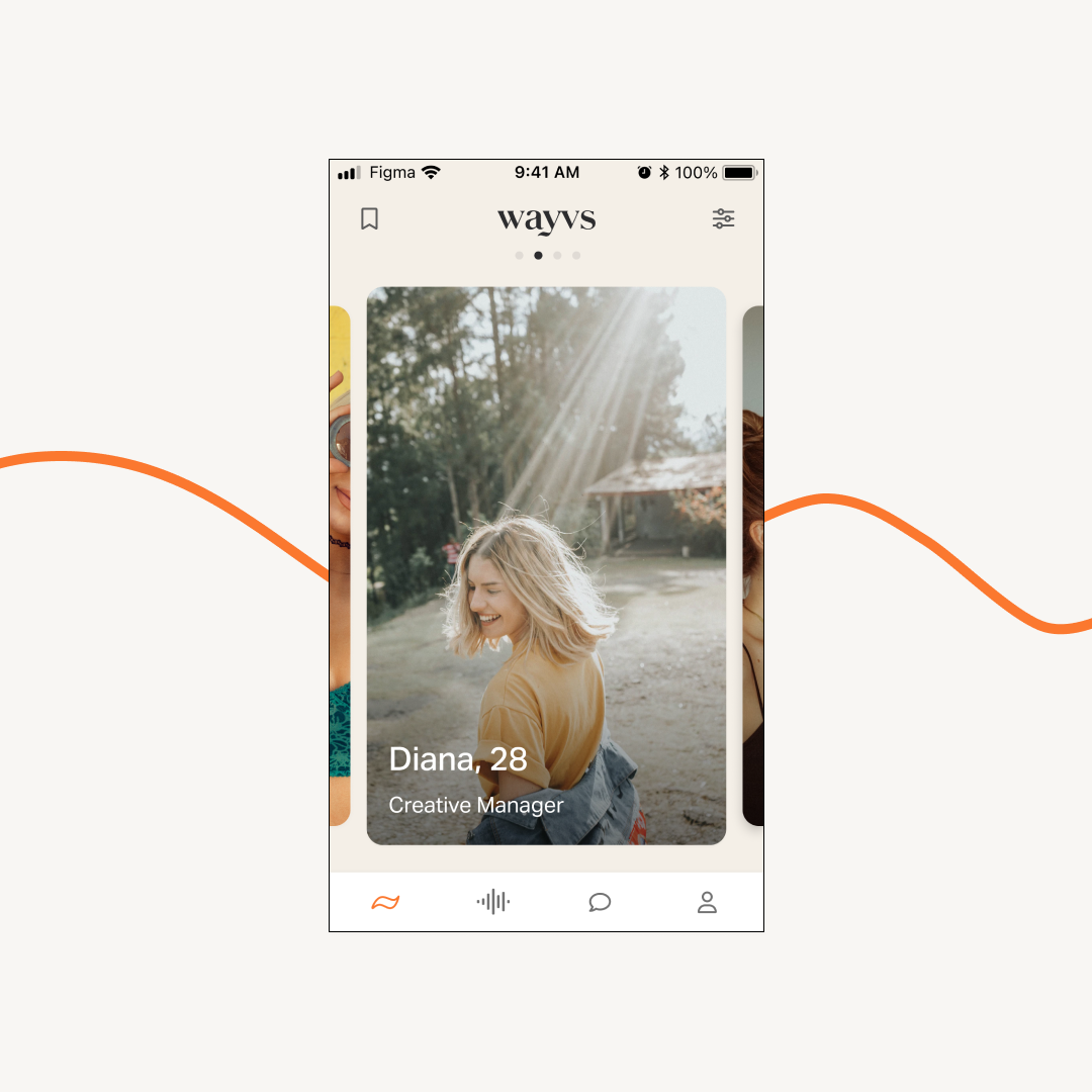
Immersive discover screen 📲
My updated home screen increased user retention by 10% in just one day.
Project description
wayvs is an audio dating app that creates authentic encounters and real connections. I boosted user retention by 10% by redesigning the home screen for our 10,000+ users.

Things weren’t great…
New users weren’t engaging with our community for more than a day or two. So our product team had to think of a solution:
How could we draw users into audio dating, the thing that sets us apart from other dating apps?
So we tried to…
Improve retention rates by incorporating audio (our unique value proposition) in the discover home screen where users can view profiles.
Here’s what I did:
UX/UI Designer
Helped the product owner sketch the feature
Conducted usability research
Built the flows (information architecture)
Visual interface design
Worked with the devs
Here’s who else was involved…
Product owner
Development team
Marketing department
Here’s how we went about it.
Starting with the research…
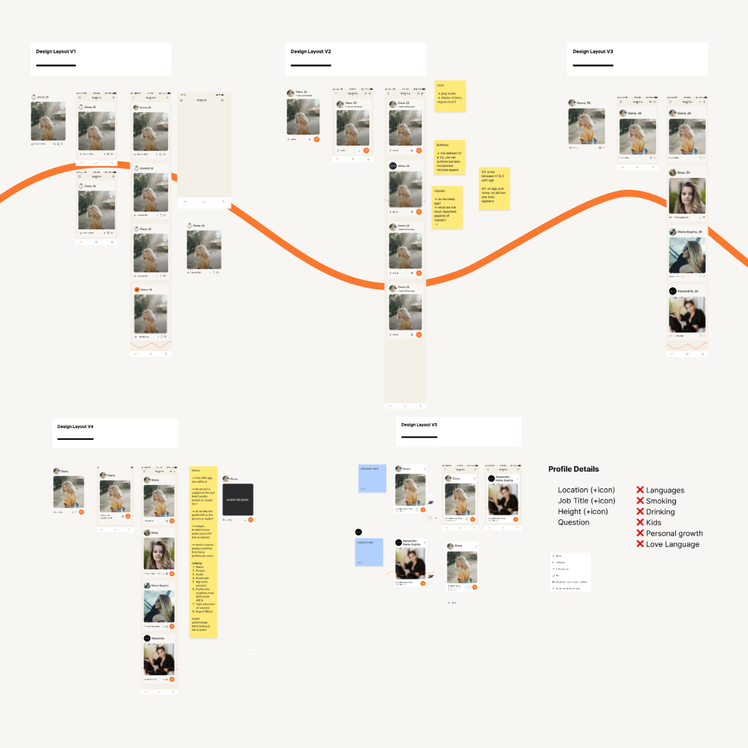
When I began the project, the product owner (PO) had already outlined a few ideas for what new user cards could look like. The proposed design was similar to other dating apps, containing basic profile information (photo, name, age, occupation, etc.), but we realised our profile cards lacked the core value proposition of our app: audio.
I started my research by sketching a new Immersive Discover (ID) screen and determined the following criteria for a prototype:
We had to continue to show basic user information such as their name and photo
It had to have easy access to listening to a wayver’s audio
It should be easy to reach the wayver’s full profile

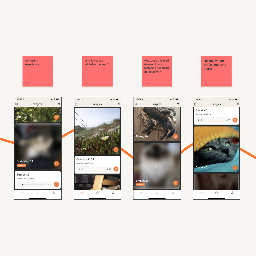
A successful failure: mix’n’match prototype…
We created a first prototype that mixed photos, video, and audio. But after some user tests, we found it to be a successful failure–the way we displayed random photos and videos was confusing. Our testers didn’t understand where a profile began or ended, and the new ID screen was mistaken for a social media feed instead of a dating app.
So we brainstormed some improvements. Most importantly, recorded audio should be attached to a wayver’s profile photo so users could listen to someone’s voice and see who was talking. Another takeaway: we needed a more structured feed with clear delineations between profiles.
I took these learnings and went back to the drawing board–or the Figma board.
Now for the design…
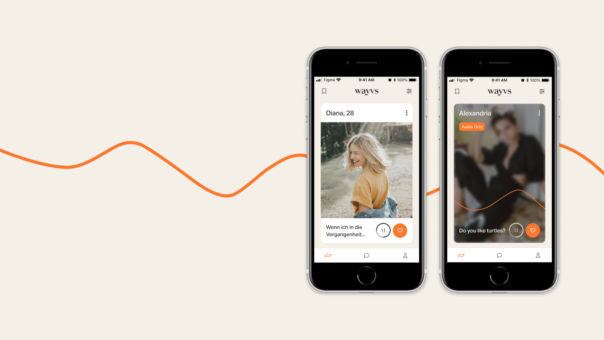
I began exploring new design directions for profile cards for both daily profile recommendations and wayvs other main feature: voyces, anonymous audio-only profiles. I had to distinguish the two profile types as premium users have access to 11 daily recommendations, while non-paying users only get 3.
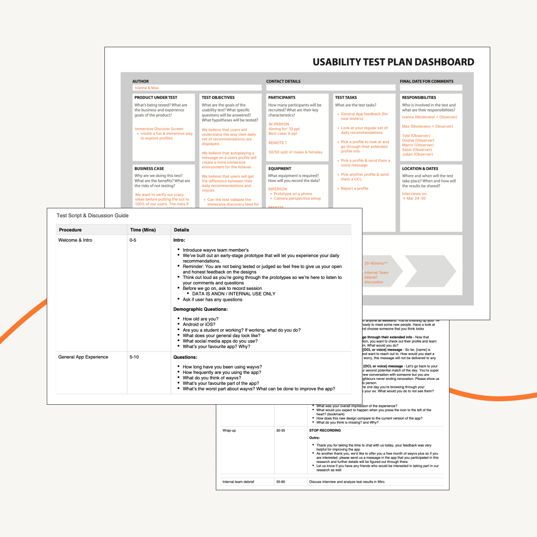
After several iterations, we settled on new profile cards for the main screen and voyces profiles. We updated our original prototype with the new cards and determined a usability test plan to answer the following hypotheses:
We believe users will understand the way their daily recommendations are displayed
We believe that autoplaying the audio recording on a user’s profile will create a more immersive experience for the listener
We believe that users will understand the difference between their daily recommendations and voyces
Then we tested…
Before optimising our new ID flow, I wanted to validate our assumptions by creating a clear and concise research plan.
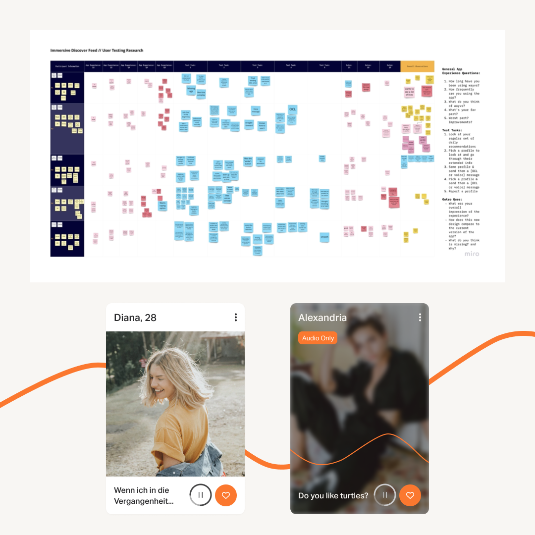
And here’s what we learned…
After the testing sessions, our testers understood the goals of the new ID screen. We saw how users naturally scrolled vertically through the profile cards and listened to recorded audio. We identified other points we could improve that we hadn’t thought of before. We came away from the session with a better feeling about the second prototype.
Here’s what worked well:
Testers listened to the audio all the way through
They understood that they should scroll vertically
They enjoyed scrolling and found it different than other swipe-based dating apps
And here’s what didn’t:
Testers still didn’t understand voyces. They didn’t get the difference between these cards and daily recommendations
They didn’t like that the audio auto-played
They didn’t understand that some profiles repeated
So we…
Differentiated voyces cards even more and added a divider between them the daily recommendations
Set audios to pause. A user can choose to play audio whenever they like
Added an animation to highlight audio messages even more
And here’s what happened:
We increased the average likes sent by 50% compared to the original design
The first day of release boosted retention by 10%
Users played almost 50% more recommended audio in immersive discover compared to the original design