Reimagining onboarding 🏄
Better onboarding means better users. My designs made ours stick around.
Project Description
wayvs is an audio dating app that creates authentic encounters and real connections. We needed to revisit our onboarding because it didn’t emphasise audio enough–our core value proposition. This made it confusing for new users who weren’t familiar with slow, audio dating.


Everyone was a bit lost…
New users had no idea what audio dating meant. They needed to understand what wayvs is about: we only show users a few profiles each day, encouraging them to “date slowly.” People weren’t getting that.
So we tried to…
Improve a user’s first experience in the app by implementing a design that reflects its core value proposition.
Here’s what I did:
UX/UI Designer
Sketched and prototyped ideas
Conducted usability research
Integrated design systems
Collaborated with tech
Worked within an agile methodology
Here’s who else was involved…
Product owner
Development team
Marketing department
Business strategy
Here’s how we went about it
Let’s take it from the top
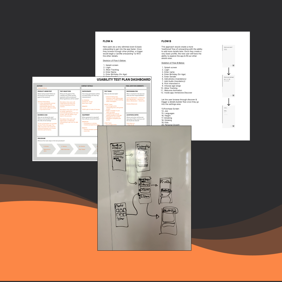
I began by reviewing our current onboarding and identifying which screens we needed to chuck in the bin. Some were important, while others were redundant. We wanted to keep it quick and get users in the app ASAP. I investigated some best practices for intuitive onboarding and conducted a competitor analysis.
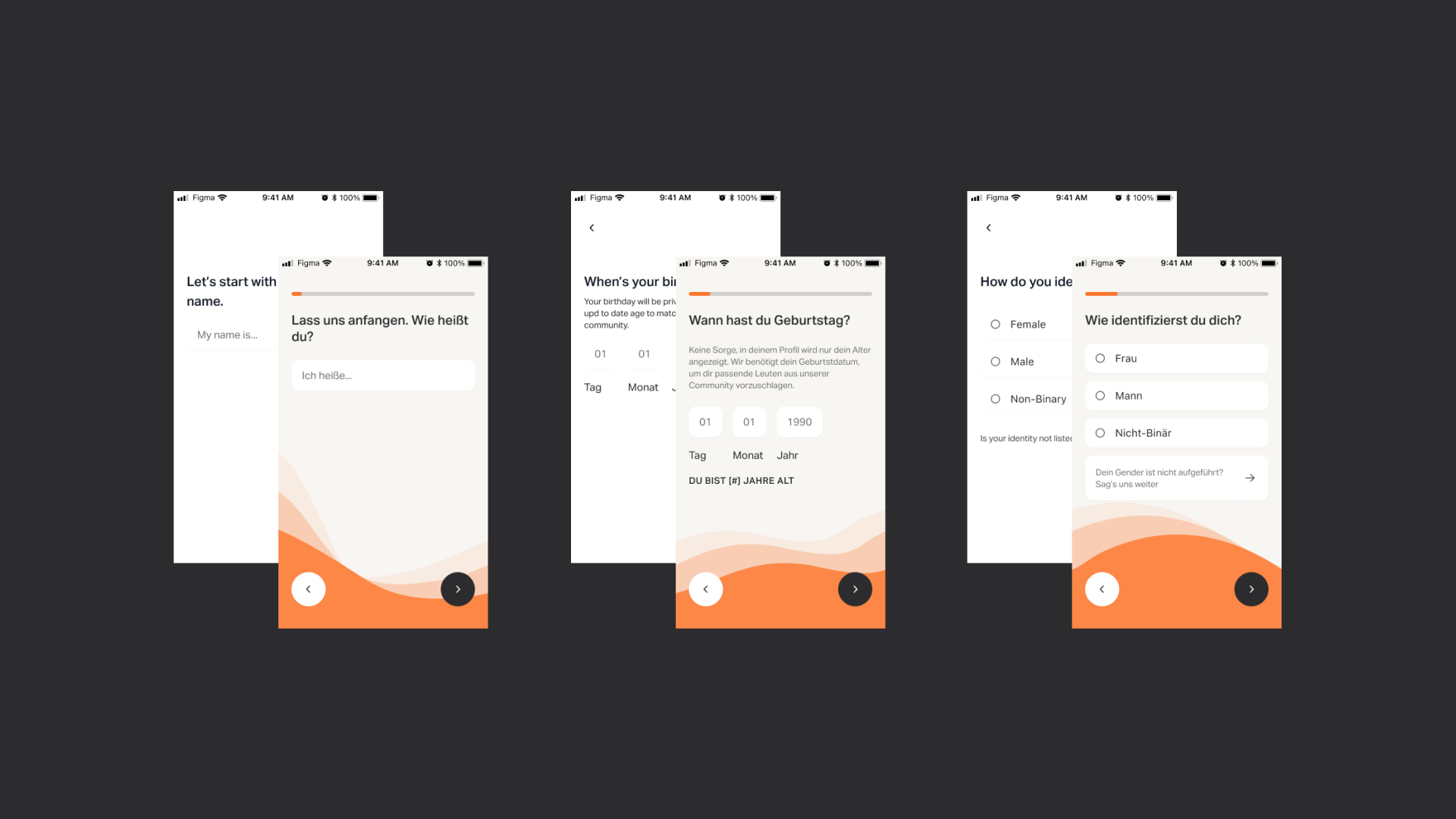
I was then able to sketch an A/B version of an updated flow: the first would be just the essential screens, so users could get to exploring the app faster, and the other followed a more traditional approach, having users input all of their details before entering the app.

Then we made some guesses
The dev team and I decided to test a fast vertical onboarding against the traditional horizontal version and came up with the following hypotheses:
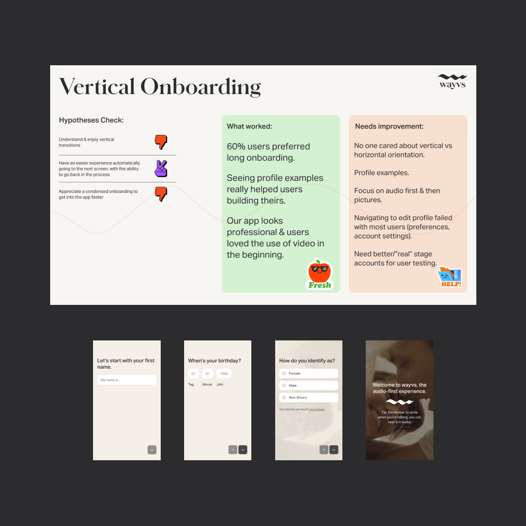
We believed users will understand and enjoy the vertical transitions
We believed that users will have an easier experience automatically going to the next screen (with the option to go back)
We believed that users will appreciate a condensed onboarding to get into the app faster
I created wireframes for the vertical onboarding flow and upgraded them into high-fidelity screens so the development team could produce the prototype.
Onto the testing
The first round of testing showed that all but one of our hypotheses had failed. Users did have an easier time going automatically to the next screen, but none of the users mentioned they preferred the vertical design over the horizontal. However, they did like the longer onboarding because it comforted them to know we were asking for details.
So we pivoted
The vertical onboarding had failed, and I went back to the drawing board (or Figma board) and continued to analyze our user testing feedback. Users wanted the onboarding to focus on audio first, and then other details. I incorporated this feedback into the longer flow and began updating our wireframes.
Although the short onboarding didn’t sit well with our testers, (they mentioned it made them feel rushed), it did reveal something else. New users wanted to see other profiles before completing their profiles. I took this learning and got down to designing.
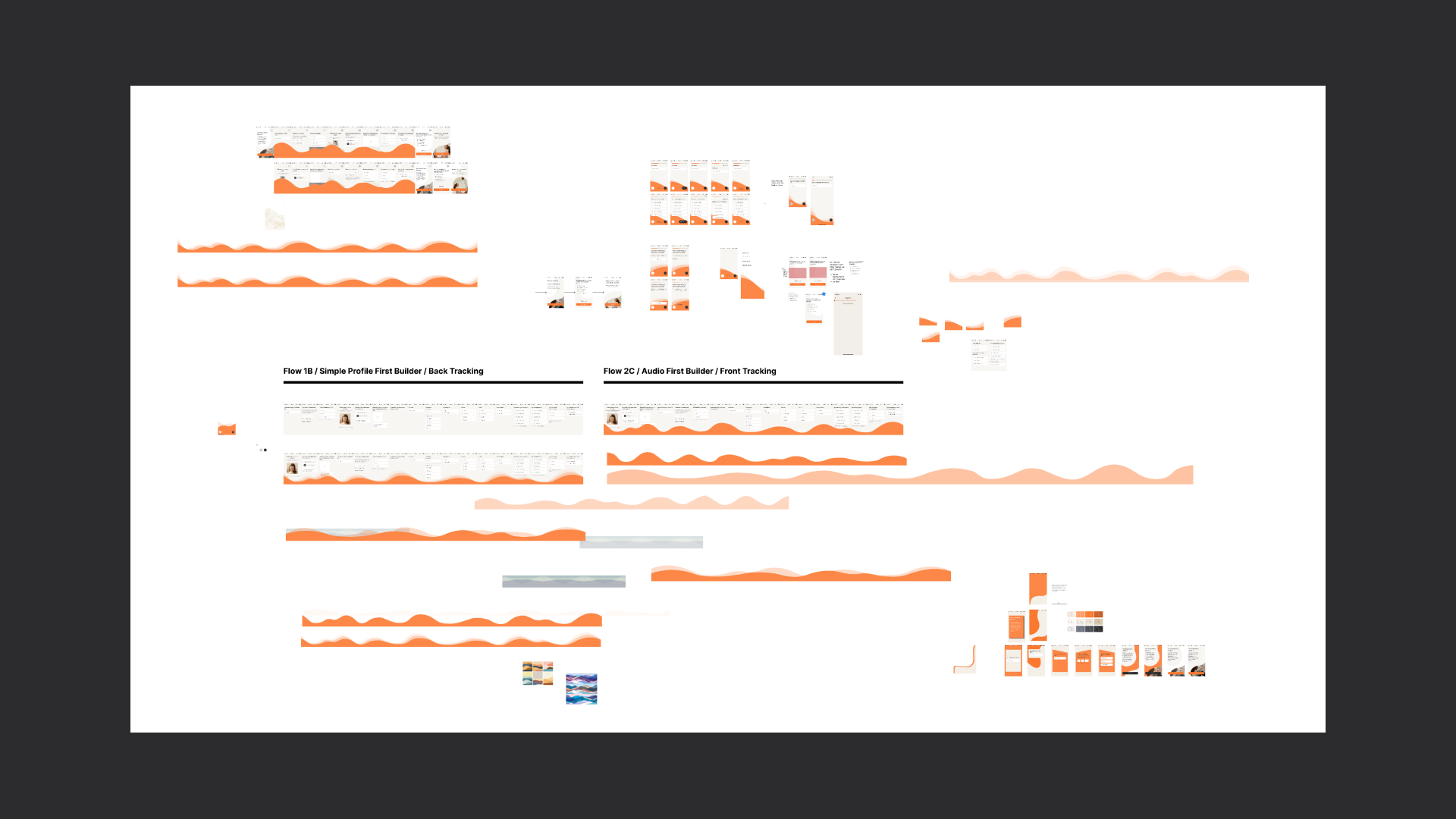
The finishing touches
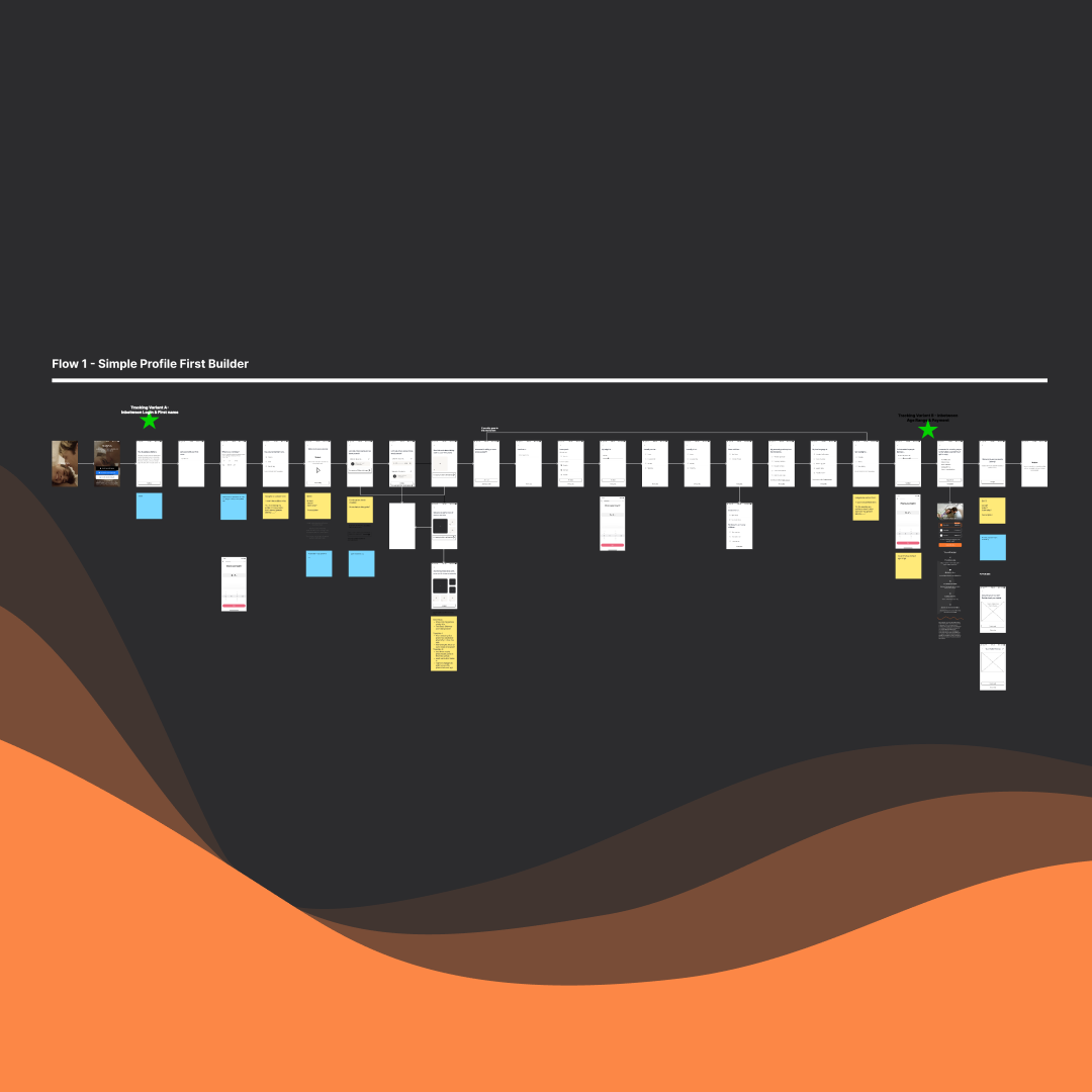
I updated our new A/B flows to test if users preferred building a simple profile with their name, birthday, gender, etc. before recording audio, versus an audio-first onboarding. I then created a digital design playground to explore engaging UI that complimented the information architecture. I decided on a continuous orange wave, showcasing our design system’s primary colour. The marketing team provided updated copy to match the energetic tone of the flow.
Ready for release
Although we had to iterate the flow, content, and UI, it was worth it. The tech team built a seamless new onboarding with all of the changes and integrated a skippable detail quiz, which allowed users to add additional information when they liked: either during the onboarding or after they’d checked out some profiles.

Some of the takeaways:
Overall, we had the following analytics in regards to the onboarding upgrade:
Creating the skippable profile detail flow saw over 60% of users fill in their details without dropping off
We saw a 20% increase in conversations compared to the previous onboarding
Although some users still drop off at the recording step, users who didn’t drop off were loyal and high-quality.
Our original idea of a revolutionary, vertical onboarding turned out to be a great failure, which pushed the team to find the next greatest idea.
After our first mid-sprint pivot and a few rounds of careful iteration, we produced a high-quality onboarding experience.
Along the way, we realized users did enjoy looking at other profiles for inspiration, and we developed a new product feature to tackle in the next sprint.